Hey all! My name is Faye Martin and you are currently on my A2 media coursework blog; a record of blogs put together reporting the process in creating our own music videos, album covers and webpages for our own invented band.
Friday, 8 April 2011
Final Product
After many hours of hard work, I am proud to say that the video above is our final product, a music video to Evanescence's 'Bring Me To Life'. This version of the video can be found on YouTube and had been posted on my own Facebook page, from this we have recieved some great feedback which has made me feel extremely happy to see that all of our hardwork has paid off and that people have enjoyed watching our video, recieving comments such as 'This is just...wow! Well done'. Now all that hard work has paid off, sit back and enjoy Forgetting Last Friday's video 'Bring Me To Life'.
Thursday, 7 April 2011
Rough Cut 2
This is the second rough cut of our video. We showed this to our teacher Mrs Thrasher and got some really good feedback which will help us progress that bit further to establish a higher grade.
Changes that were suggested:
Changes that were suggested:
- 00:51 - Sitting on the floor - possibly longer as this holds more suspense than the blackout
- 01:00 - Centre the shot as the singer is to one side of the screen
- 01:12 - When she is going down the stairs she should progress further
- 01:35 - More of the artist as this is what the audience are watching to see
- 02:00 - Maybe change the shot
- 02:20 - Zoom in closer
- 02:50 - Maybe change the shot
- 02:55 - Zoom in or make the shot longer
- 03:00 - I think this part is slightly out of sync
Wednesday, 6 April 2011
Production-Final Album Cover
This post shows how I produced my final album cover using the software Photoshop.
Firstly I found and manipulated the colours of the picture of the forest, by this I changed the hue and saturation, contrast and brightness.
Next I uploaded and copied the pictures of the mushrooms, this added the idea of fantasy to the image.
Then I added a layer above the background image, it was black and then changed the opacity, this created a darker feel to the image.
The shadow of the wolf was then added, this was one done through the blending options and colour filled it with black and then changed the opacity.
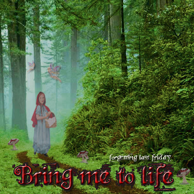
Then the final text was added using the font 'beyond wonderland' and the image of Little Red Riding Hood.
Back of the cover:
On photoshop I have manipulated the image of the forest in terms of hue and saturation, brightness and contrast. This image has been reversed to reflect that we are now looking at a different perspective (from the back).
Then I added another layer to the image, it was black then I edited the opacity to add the eery feel to the forest. Then I used the same image of the wolf but put it in the foreground to show that this is from a different perspective of the front image.
Then the fonts of the production info, band name and websites were added to the back.
Lastly the track last was added including vital details found on the back cover such as the track length, performers and producers.
Final Album Artwork
My final album artwork is a development from the following preliminary design:


This design developed to this front cover:
After studying into postmodernism I thought of the idea to create my album cover to highlight aspects of postmodernism as the famous fairy tale of Little Red Riding Hood is portrayed. The reasons for my decision to reflect Little Red Riding Hood is that the tale includes death and deceit, which can be thought of a code of the music genre. Also it highlights the idea of fantasy which is associated with the gothic genre. The image created of Little Red Riding Hood in the forest with the shadow of the wolf also composes a a contrasting image between the two characters as she is shown to be innocent and the wolf to be dark and a scary creature. If this was to be put on the shelves in the shop I think that this would stand out due to colours and the obvious association made with the tale. Within this cover I have also adopted the conventions of album covers such as the title of the album, bands name and the parental advisory sign.
The back of the cover:
The back of the cover is a continuation of the front as it is the same image of the back cover. The conventions adopted on the back are the track list, barcodes, production information and company details.
Monday, 4 April 2011
Responses from the Showcase
After showing our first rough cut version of the video at the class showcase we recieved some great feedback and helpful constructive criticism which will help us to progress to create a really good end product, hopefully. Our fellow classmates had to fill in an audience feedback sheet which had the following questions on:
- What was especially good about the music video?
- Would you watch this again? If yes why, if no, why not?
- Did you notices any serious issues such as continuity errors, strange edits-Did anything not make sense to you?
Here is some of the feedback that as a group we recieved:
- What was especially good about the music video?
'The quick cuts at the end of the video'
'Editing on the beat'
'It made sense, looked very professional'
'Good use of colour corrector'
'Great closing shot'
- Would you watch this again? If yes, why, if no, why not?
'Yes, I like the song'
'Yes-Brilliant'
'Yes, good shots and edits'
'Yes, there was an element of suspense created, you leanr about the character which makes you want to watch more'
- Did you notice any serious issues such as continuity errors, strange edits-Did anything not make sense to you?
'There were some shots missing'
'Within the chours the quick edits weren't used, I had lost interest'
'Some shots were too long'
'The field shots get to repetitive'
Rough Cut of the Video
This is version of the video that we showed within our showcase, all the comments that were made on the video was on this version of how we shall improve and finish.
Subscribe to:
Comments (Atom)


